 ColorType & shapeIconsComponentsIn contextTokensRetrospective · simulatedColorType & shapeIconsComponentsIn contextTokensRetrospective · simulated
The rules the app already followed, written down: one palette, one typeface, one icon family and a set of components, documented the way I would build them today.
● Retrospective, built in 2026 on the original app
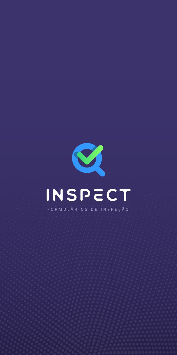
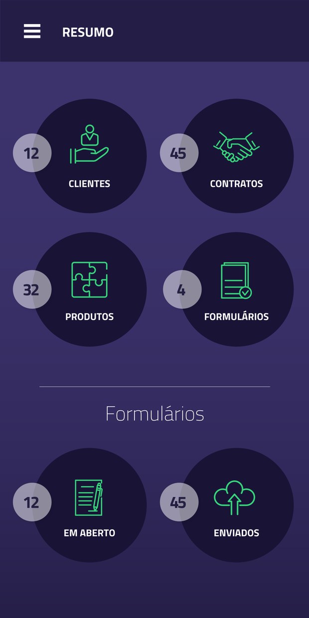
Seven hues were already in the app. Each now has a role and a token, and four of them grow into nine-step ramps for states and surfaces.
The original had two greens: #5AE770 on buttons and #36D57B on icons. Both stay, as steps 500 and 600 of one ramp.
Steps 100–400 mix the base with white, 600–900 with Ink. Same pattern as the EasyTags theme scale.
Cairo ExtraLight and Bold come from the original identity board. Regular is added for running text.
The outline icon set drawn for the app, 2 px stroke and rounded caps, with a token per glyph.

ins-icon-clientes
ins-icon-contratos
ins-icon-produtos
ins-icon-formularios
ins-icon-em-aberto
ins-icon-enviados
ins-icon-adicionar
ins-icon-concluido
ins-icon-foto
ins-icon-anexo
ins-icon-sincronizar
ins-icon-imagem
ins-icon-editar
ins-icon-editar-caixa
ins-icon-falha
ins-icon-vazio 123
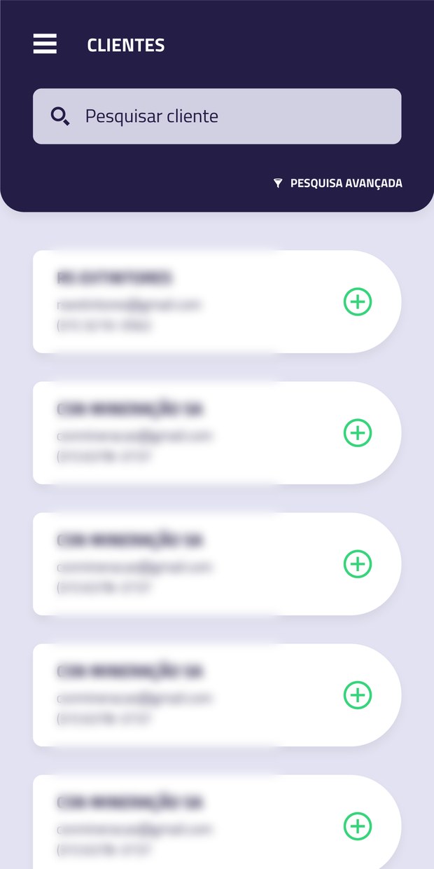 456
 78
:root {
  /* color · core */
  --ins-ink-900: #241D46;      --ins-indigo-700: #3B326C;
  --ins-haze-500: #6F6A8C;    --ins-mist-300: #D5D5D7;
  --ins-lav-100: #E2E2F2;
  --ins-green-500: #5AE770;  --ins-green-600: #36D57B;
  --ins-blue-500: #3398FE;    --ins-blue-700: #2273A9;
  --ins-blue-800: #2B5397;   --ins-haze-700: #544E73;   /* small text + links */
  --ins-red-500: #FF6666;

  /* type */
  --ins-font: "Cairo", system-ui, sans-serif;

  /* space · 4 pt grid */
  --ins-space-1: 4px;  --ins-space-2: 8px;  --ins-space-3: 12px;
  --ins-space-4: 16px; --ins-space-6: 24px; --ins-space-8: 32px;

  /* shape */
  --ins-radius-sm: 4px; --ins-radius-md: 12px;
  --ins-radius-lg: 20px; --ins-radius-pill: 999px;
  --ins-shadow-card: 0 6px 18px rgba(36,29,70,.14);
}